Building and customizing reports in the explore view just got a lot more intuitive. We redesigned the filtering experience and added chart visualizations, so you can spend less time wrestling with your data and more time taking action based on it.
The new filters allow you to start a report from scratch by picking a main data point from the first dropdown. You can then add columns using the plus icon at the top of the table, or narrow down what you see by adding filters in the filter bar. You can also use the same controls to tweak any existing report you already have in the explore view — whether you built it yourself, started from a template, or landed there from a standard report page.
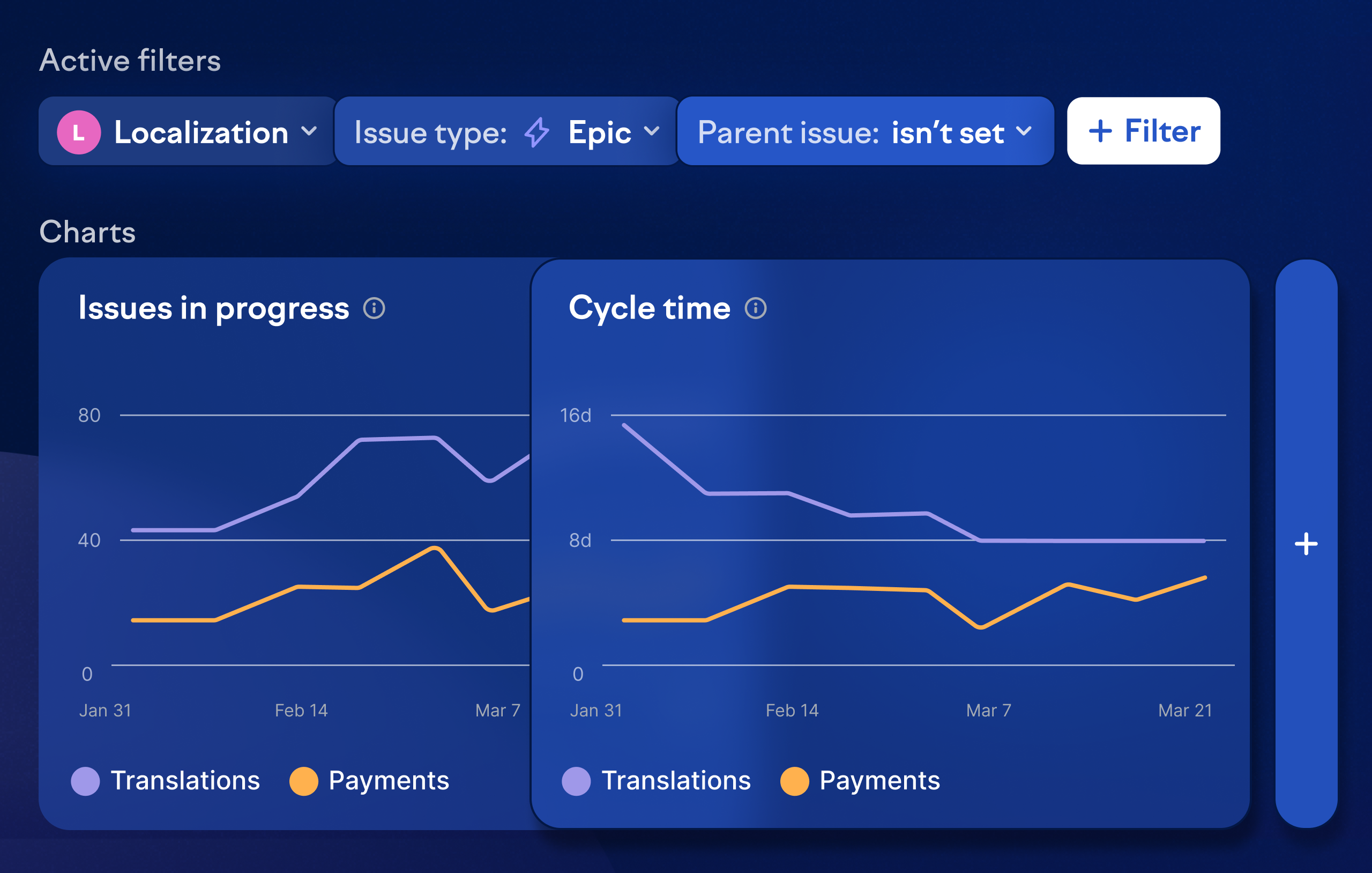
Tables are great for detail, but sometimes you need the big picture at a glance. Click the add chart icon to get a visualization of your data. This is especially useful when you want to see how a metric has shifted over a given time period.
There are a few ways to start exploring your data: navigate to the explore view directly and pick a ready-made template or start from a blank slate, click the explore button on any standard report page and customize from there, or ask Swarmia AI a question and refine the results further in the explore view.