“The world is full of well-meaning people who believe that anyone who can write plain English and has a modicum of common sense can produce a good questionnaire.”
— A. N. Oppenheim, Questionnaire design and attitude measurement (1966)
Grab Google Forms. Ask what you want to know. Beg people to respond. Anyone can create a survey, as we’ve all answered more of them than we’d ever like, right?
Sometimes, we get fooled by the fact that well-designed surveys are simple to fill. But there’s more to creating one than it might seem at first. Maybe you’re familiar with symptoms like not getting responses, seeing more noise than signal, or not finding actionable results.
When done well, surveys gather unique quantitative and qualitative data at scale. Sure, there’s no need to over-engineer your next questionnaire on dietary restrictions and t-shirt sizes. But methodology matters in things like user research, personal evaluation, and measuring developer experience. Poor survey design can seriously compromise the results, leading to the wrong conclusions.
Astonishingly, many dedicated survey products, some of them “research-based,” get even the basic things wrong. Keep reading to learn how you can avoid the usual pitfalls.
No easy answers
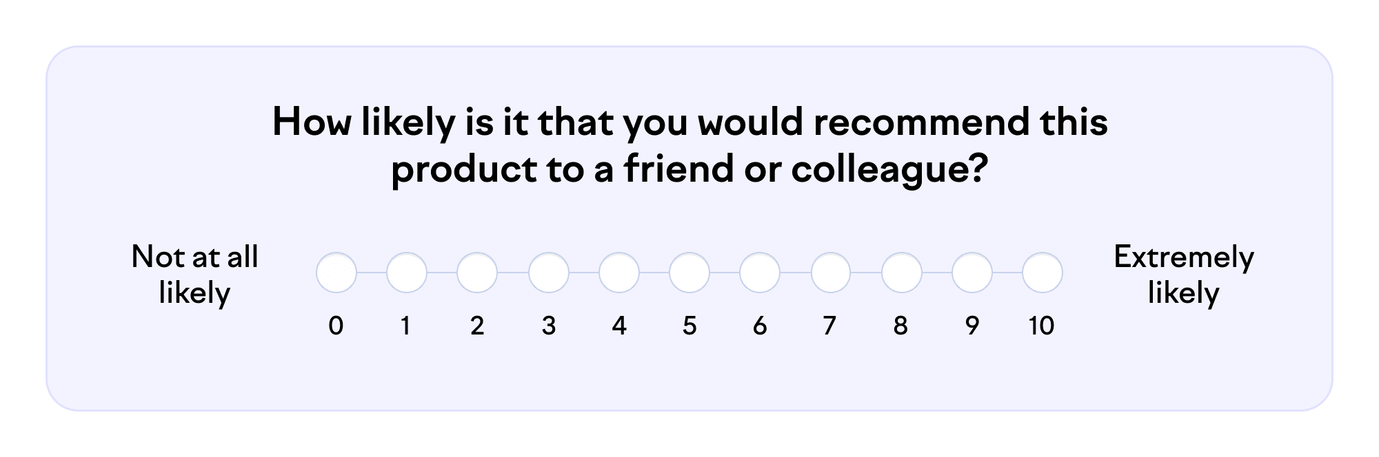
Think about your office chair. Now, try to answer the following:
You might recognize your mind going through these simplified stages in a couple of seconds:
Comprehension. You read the question and try to understand it.
Retrieval. You recall events associated with the chair. Perhaps you’ve already recommended it to someone. Or maybe you got back pain while sitting in it last week.
Judgment. You assess the relevance of the memories and integrate them. How do comfort, durability, adjustability, price, and aesthetics translate into the likelihood of recommendation?
Response. You interpret the scale and choose the appropriate number on it to represent your experience.
You can see there’s a lot to consider, even for a simple question like this. When the cognitive load accumulates, respondents get less attentive and make more errors. Frustration can make people abandon the survey. In addition, each of the four stages can introduce its own type of bias through ambiguity and different interpretations.
Next, we’ll explore strategies for preventing confusion with clear questions and sensible scales.
Calling questions into question
The obvious first step is to ensure all respondents understand the question the same way. You probably want to avoid survey items like “How inexorable is BDUF in our sui generis SDLC?”
Often, you’d like to measure high-level concepts, like the efficiency of team processes. But asking an abstract question like “How efficient are our team processes?” can make it hard for the respondent to retrieve and judge relevant examples. “Efficient” in terms of reducing technical debt, delivering a project on time, or minimizing cloud computing cost? Furthermore, Matt might think of a code review this morning while Rebecca considers recovering from a production incident eight months ago.
Instead, try to define tangible examples representing the thing you want to measure. Anchor them to a context: who, when, and where. This reduces random noise and makes the responses comparable with each other. For example, you could ask, “In the past month, how often did team Dumbo rely on other teams to get its work done?” If added context makes your survey items too long, you can alternatively present the anchors as short instructions on the side.
Another typical peril is cramming multiple matters into one question: “How fast and stable are our automated tests?” What should I answer if our tests are rapid but rickety? Coupling concepts together introduces noise and masks problems behind middle-of-the-scale answers. Usually, the words “and” and “or” are signs that you should split the statement into multiple items.
So, you might end up with more questions but with higher-quality answers and less cognitive load on the respondents. You can use statistical methods with the response data to identify clusters of items correlating with each other, forming latent variables. Perhaps you’ll name one of those variables “efficiency of team processes” or discover an entirely new factor.
Finally, while subjectivity in surveys is unavoidable, you can make efforts to minimize individual differences when measuring system-level phenomena. For example, “How easy is our code to understand?” markedly depends on the respondent’s experience with your tech stack. Differences across teams might arise more from developer seniority than codebase quality. If you know the respondents’ background information, you can statistically control for those variables. Alternatively, you can inhibit intervening variables with less personal questions such as, “How modular is the code in our frontend repository?”
Tilting the scales
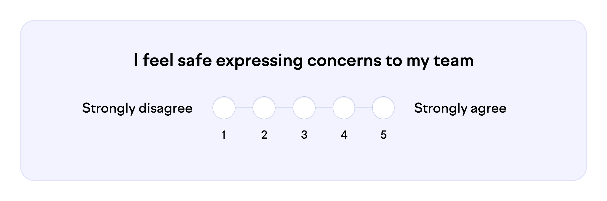
To turn qualitative attributes into numbers, you need a rating scale. When in doubt, use the Likert scale (pronounced "LICK-urt" not "LIE-kurt” — a common mistake). Because it indicates the respondent’s level of agreement, the same scale can be used with any survey item formatted as a statement:
In addition to Likert, there are other attitudinal rating scales. It’s completely fine to use those, but there are some pitfalls. Let’s look at a few examples.
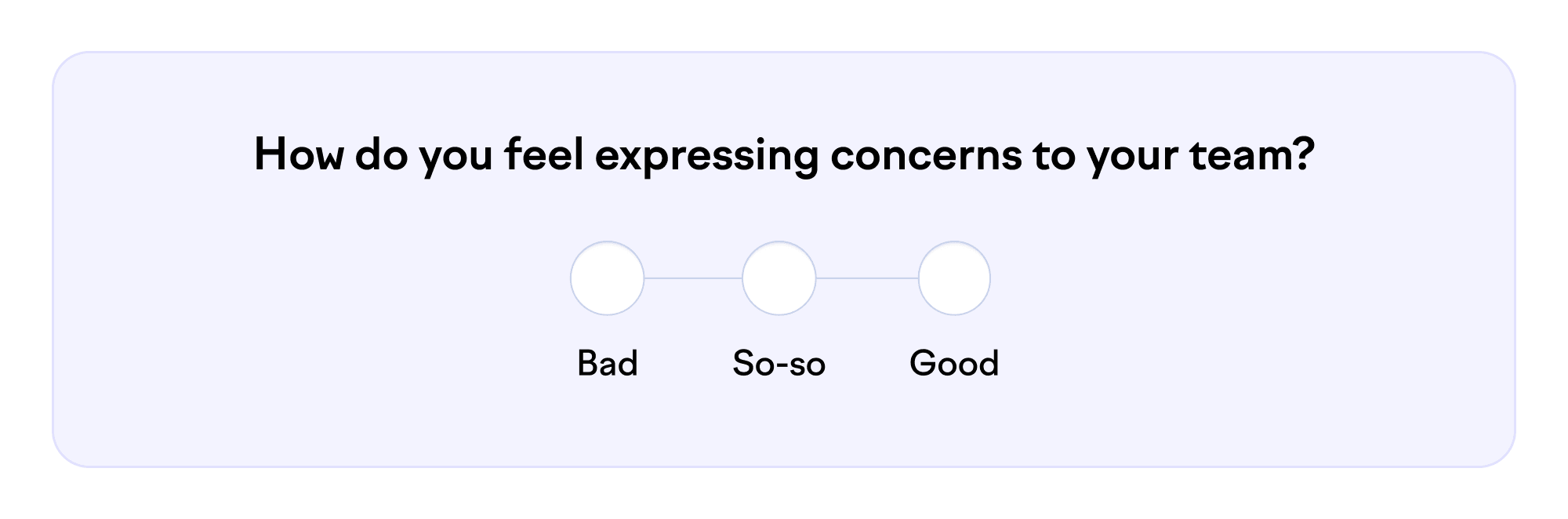
Ambiguity is a problem not only in question-setting but also in scales. Does “bad” mean you anticipate a hostile response or just don’t have high hopes for positive change? Or maybe you feel bad about yourself because you express concerns so often. The dictionary has plenty of precise words, so there’s no excuse for this extra source of noise.
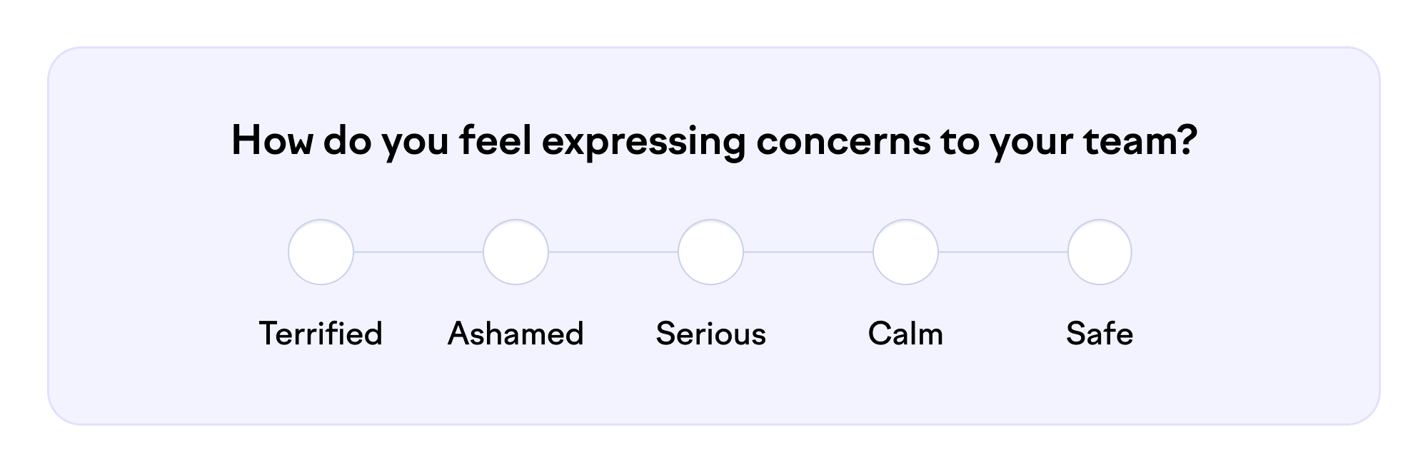
Let’s try something more specific:
Can you put these feelings on one scale? Mixing different dimensions in the same range leads to confusion. How do you respond if you’re annoyed or proud? Most statistical methods, even simple averages, work only with scales that are linear, that is, one-dimensional and evenly divided.
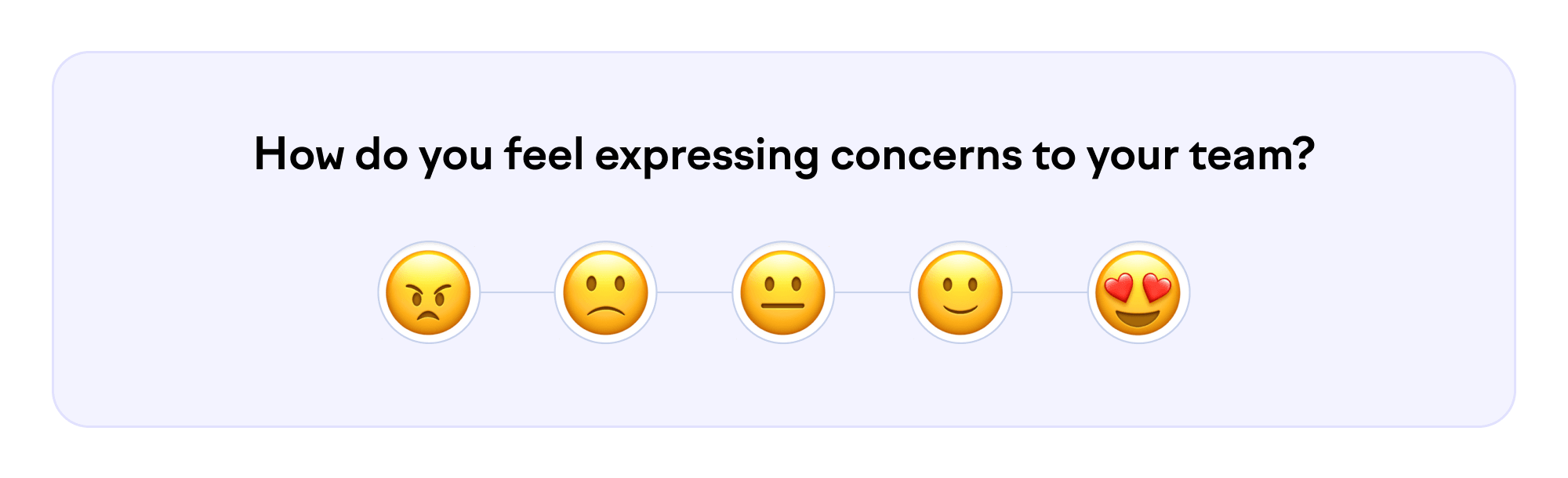
In some surveys, the options are presented as emojis or icons:
This has similar problems to the previous example. Does 😍 represent romantic love, affection, enjoyment, or something else? Different interpretations generate noise. Also, is the step between 😠 and 🙁 equal to the step between 🙁 and 😐? Just stick to words and linear scales. (How boring!)
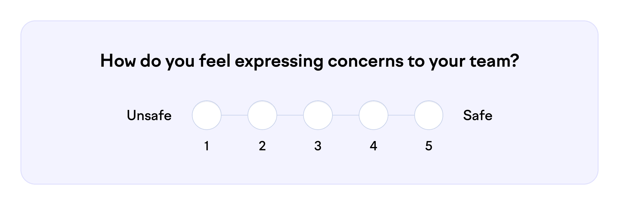
A better alternative is the semantic differential scale, which uses symmetrically opposite adjectives and equal steps in between:
Here, you need to be careful to choose words from the same dimension. Don’t define the opposite of “happy” as “anguished,” “anxious,” or “angry.” That has the problem of coupling two different phenomena in one survey item all over again.
Then, the age-old question: How many points should you have on the scale? Probably five to seven. You lose out in resolution with fewer than five points, whereas humans have trouble distinguishing between more than seven options. An even number of points prevents a neutral response, but some studies indicate it can result in random selection between the two centermost options.
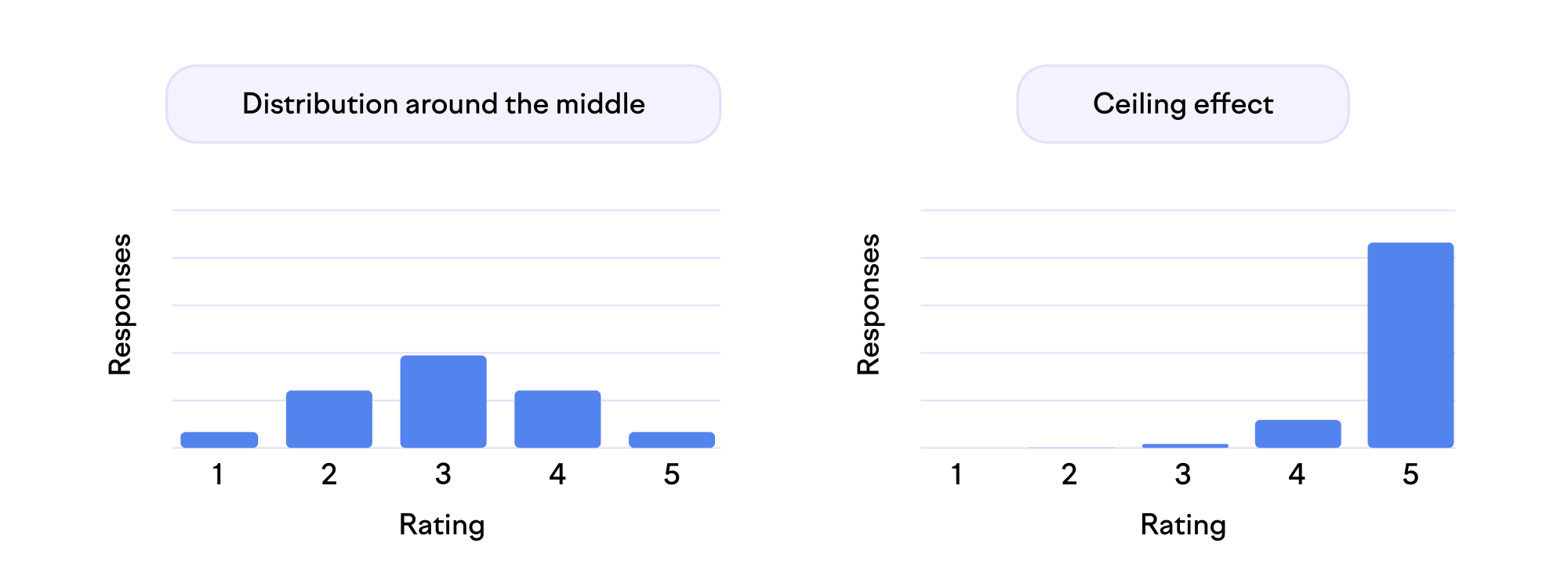
The points on the scale are worthy only if the respondents use them. If you only get ratings at the very top of the scale (ceiling effect) or the bottom of it (floor effect), you effectively have a smaller scale. Basically, many respondents would have chosen an option from outside your range. The typical aim of distinguishing between most answers gets harder. To address this, you can guide the distribution towards the center with phrasing. For example, most people might agree that the company meetings are tolerable, but fewer think they’re outstanding.
Reality check
As we can see, there are plenty of ways to improve survey quality. Not only do they make the results more accurate and actionable, but they also deliver a nicer experience for the respondents.
Yet, no plan survives contact with reality. No matter how well you apply the theory, you need real response data to test and verify the questionnaire. That includes determining its reliability (consistency of results) and validity (correspondence with the real world). Statistical methods like confirmatory factor analysis measure how well groups of survey items correlate with the related constructs.
But that’s a topic for another blog post. For now, I’ll leave you with a checklist of the topics discussed here you can use as a reference. If you’re an expert, you can probably point out exceptions in these, but they are a good starting point for most of us.
Good survey items are:
Understandable. Avoid acronyms and jargon. Use short words and sentences.
Tangible. Help respondents recall specific types of recent events.
Contextual. Explicitly define who, when, and where.
Particular. Measure only one thing. Avoid the words “and” and “or.”
Objective. Minimize the effect of intervening variables like work experience or personality.
Linear. Use a one-dimensional and evenly divided scale.
Balanced. Aim for most responses around the center of the scale.
Run better developer experience surveys
Swarmia allows you to correlate system metrics with feedback from software engineers. Get started today.